Originally published in March 2023. Updated in November 2026 with a look at which of these trends held up.
In early 2023 we picked five UI trends we expected to shape interfaces that year: dark mode, minimal design, brutalism, neumorphism and 3D. Trend lists age fast, so instead of quietly deleting this post we went back to check each one against what we actually design for clients today. Some became standard practice, one stayed a niche style, and one mostly disappeared. Here is the honest scorecard, plus what to do with each trend if you are planning a website or app now.
1. Dark mode: now a baseline expectation
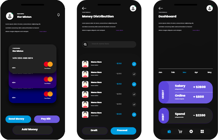
Dark mode went from a nice extra to something users simply expect. Every major operating system supports it, most popular apps offer it, and many people switch automatically at night. On phones with OLED screens it also saves battery, because dark pixels use less power. The claim that it reduces eye strain is less clear: research is mixed, and long passages of light text on a dark background can be harder to read for some people.
What to do in 2026: treat dark mode as a theme you design properly, not an inverted colour scheme. Use dark greys rather than pure black for large surfaces, check text contrast in both themes, and test images and logos on dark backgrounds. If you build in WordPress, plan dark mode early in the design system rather than adding it after launch.
2. Minimal design: still winning, but with more personality
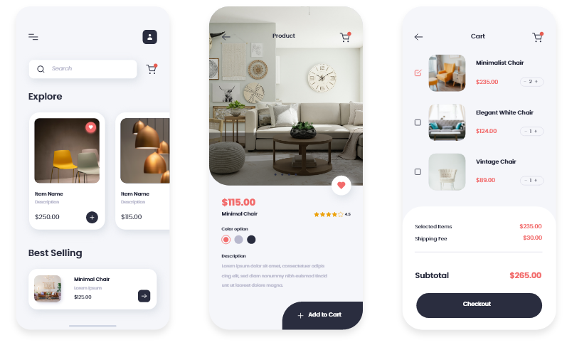
Clean, uncluttered layouts are still the safest choice for most business websites, because they put the message and the call to action first. What has changed is that “minimal” no longer means bland. The strongest minimal sites now combine plenty of white space with one bold element: a distinctive typeface, a striking product image or a single confident colour.
What to do in 2026: remove anything that does not help a visitor decide, but give the page one memorable thing. Minimal design also tends to load faster, which helps both conversions and SEO.
3. Brutalism: a niche style, not a mainstream trend
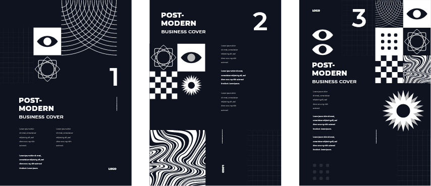
Brutalist design, with raw layouts, heavy borders, clashing type and deliberately unpolished elements, is still around, mostly on portfolios, fashion brands, music and creative studios. It never became mainstream for business sites, and for good reason: it is harder to scan, and it can make a company feel less trustworthy if the audience is not expecting it.
What to do in 2026: use brutalist touches only when the brand genuinely calls for it and the audience will read it as confident rather than broken. Bold typography and visible grid lines can borrow the energy of brutalism without hurting usability.
4. Neumorphism: mostly gone
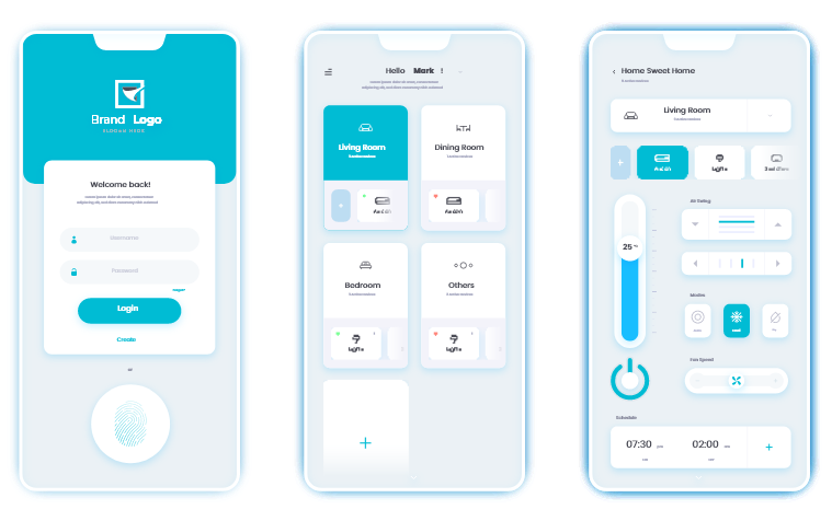
Neumorphism, soft extruded buttons and cards made with subtle light and dark shadows, looked fresh on Dribbble but rarely survived real products. Its biggest problem is contrast: buttons barely stand out from the background, which makes interfaces harder to use, especially for people with low vision, and conflicts with accessibility guidelines such as WCAG.
What to do in 2026: skip it for anything people need to use. The idea that did survive is depth: layered, translucent surfaces like the glass-style interfaces Apple introduced in 2025 give a similar soft, tactile feel while keeping text and controls readable.
5. 3D: here to stay, used with more restraint
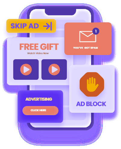
3D illustrations, product renders and interactive models are more common than ever, helped by better browser support and lighter file formats. The difference since 2023 is restraint. The best sites use 3D where it explains something, such as showing a product from every angle, rather than as decoration that slows the page down.
What to do in 2026: use 3D for your hero product or one key explanation, compress it carefully, and always provide a fast-loading fallback image for slower phones.
What has taken their place
A few patterns that were barely on the radar in 2023 now show up in most of the interfaces we design:
- Bento grids: modular card layouts that summarise several features or benefits at a glance, popularised by product pages from large tech brands.
- Glass and depth: translucent, blurred layers that create hierarchy without heavy shadows.
- Expressive typography: large, variable fonts doing the work that hero images used to do.
- Purposeful motion: small animations that confirm an action or guide attention, rather than effects on every element.
- Accessibility as a requirement: stronger contrast, visible focus states and keyboard support, driven partly by regulation such as the European Accessibility Act.
The takeaway
Trends that improve clarity, speed or usability tend to stick. Trends that only look good in a screenshot fade. Before adopting any new style, ask whether it makes the page easier to understand and act on. If it does not, it will probably date your site within a year or two.
Planning a redesign and not sure which direction fits your brand? See how we approach UI/UX design or tell us about your project.